Create Beautiful Banners and Other Graphics Easily Using HTML and CSS - Examples

Hey! I'm a Full Stack Software Engineer with over 10 years experience in the industry. I've built entire platforms end to end, helped others create amazing things, and have drunk copious amounts of coffee, red-bull and beer to get here. I feel like now is the time I start giving all this knowledge and experience back to younger developers that need it. Hopefully I can help you on your journey to becoming an Engineer.
Introduction
I previously posted about using HTML and CSS to create banner images on the fly without the use of any tooling other than chrome.
Create Beautiful Banners and Other Graphics Easily Using HTML and CSS
It seemed to garner a fair amount of interest, so I thought I would extend it with some base examples of banners I have used in the past.
All examples are set to 1600x840 as that is the recommended resolution for cover images on hashnode, all examples can be tweaked to your preferences easily.
Simple Gradient Banner
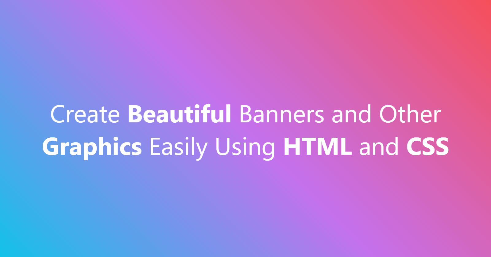
Slightly more in depth than the original article, but the same simple principle 👍
<html lang="en">
    <head>
        <meta charset="UTF-8">
        <meta http-equiv="X-UA-Compatible" content="IE=edge">
        <meta name="viewport" content="width=device-width, initial-scale=1.0">
        <title>My Banner</title>

        <style>
            /* Perform the ritual sacrifice to the gods of W3C */
            *, *::before, *::after {
                box-sizing: border-box;
            }

            .banner {
                /* Desired width */
                width: 1600px;

                /* Desired height */
                height: 840px;

                /* A nice looking gradient at a 45deg angle because i'm edgy */
                background: linear-gradient(45deg, #12c2e9, #c471ed, #f64f59);

                /* White text seems appropriate */
                color: white;

                /* Some padding to help text wrap nicely */
                padding: 5rem;

                /* Chrome supports Segoe UI out of the box and it's usually good enough for banners */
                /* Easy to import a custom font though! */
                font-family: Segoe UI;

                /* And finally just use flex-box to center the text vertically */
                display: flex;
                justify-content: center;
                align-items: center;
            }

            .text {
                /* Center the text horizonally too */
                text-align: center;

                /* Font size set to whatever looks best */
                font-size: 80px;
            }
        </style>
    </head>
    <body>
        <div  class="banner">
            <div class="text">Create <strong>Beautiful</strong> Banners and Other <strong>Graphics</strong> Easily Using <strong>HTML</strong> and <strong>CSS</strong></div>
        </div>
    </body>
</html>
3D Transform Banner
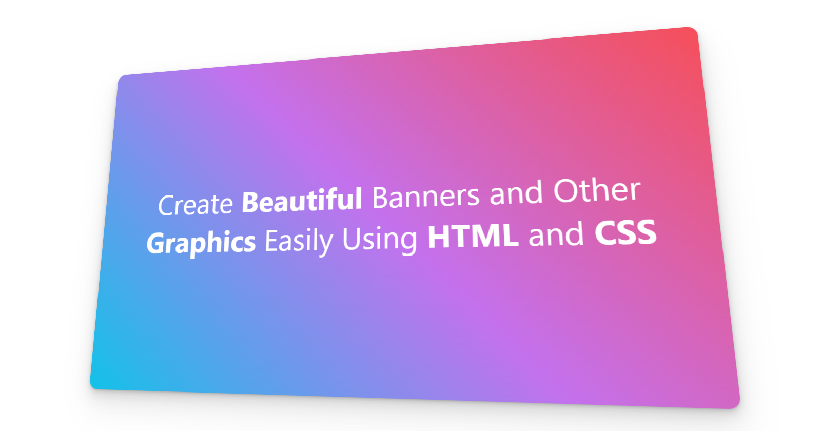
Using the power of transform to rotate a div on the x and y axis looks really nice when combined with the perspective function and can create real depth. This example uses the same gradient as before, but you can do what you like! Throw in a background image, and it can look amazing!
If you use React, check out Create Beautiful 3D Perspective Images Easily Using React and CSS to really have some fun with perspective transforms!
<html lang="en">
    <head>
        <meta charset="UTF-8">
        <meta http-equiv="X-UA-Compatible" content="IE=edge">
        <meta name="viewport" content="width=device-width, initial-scale=1.0">
        <title>My Banner</title>

        <style>
            *, *::before, *::after {
                box-sizing: border-box;
            }

            .container {
                width: 1600px;
                height: 840px;
                display: flex;
                justify-content: center;
                align-items: center;
            }

            .banner {
                /* Whatever width and height seems good for the card within the banner space */
                width: 1200px;
                height: 680px;
                background: linear-gradient(45deg, #12c2e9, #c471ed, #f64f59);
                color: white;
                padding: 5rem;
                font-family: Segoe UI;

                display: flex;
                justify-content: center;
                align-items: center;

                /* Perspective magic */
                transform: perspective(1000px) rotateX(10deg) rotateY(-10deg) scale3d(1,1,1);

                /* Make it pretty */
                border-radius: 18px;
                box-shadow: rgba(0, 0, 0, 0.07) 0px 1px 2px, rgba(0, 0, 0, 0.07) 0px 2px 4px, rgba(0, 0, 0, 0.07) 0px 4px 8px, rgba(0, 0, 0, 0.07) 0px 8px 16px, rgba(0, 0, 0, 0.07) 0px 16px 32px, rgba(0, 0, 0, 0.07) 0px 32px 64px;

                /* Perspective transform can offset the element, this is just to move it back to a more centered origin */
                position: relative;
                left: -60px;
            }

            .text {
                /* Center the text horizonally too */
                text-align: center;

                /* Font size set to whatever looks best */
                font-size: 60px;
            }
        </style>
    </head>
    <body>
        <div class="container">
            <div  class="banner">
                <div class="text">Create <strong>Beautiful</strong> Banners and Other <strong>Graphics</strong> Easily Using <strong>HTML</strong> and <strong>CSS</strong></div>
            </div>
        </div>
    </body>
</html>
Gradient Glow Banner
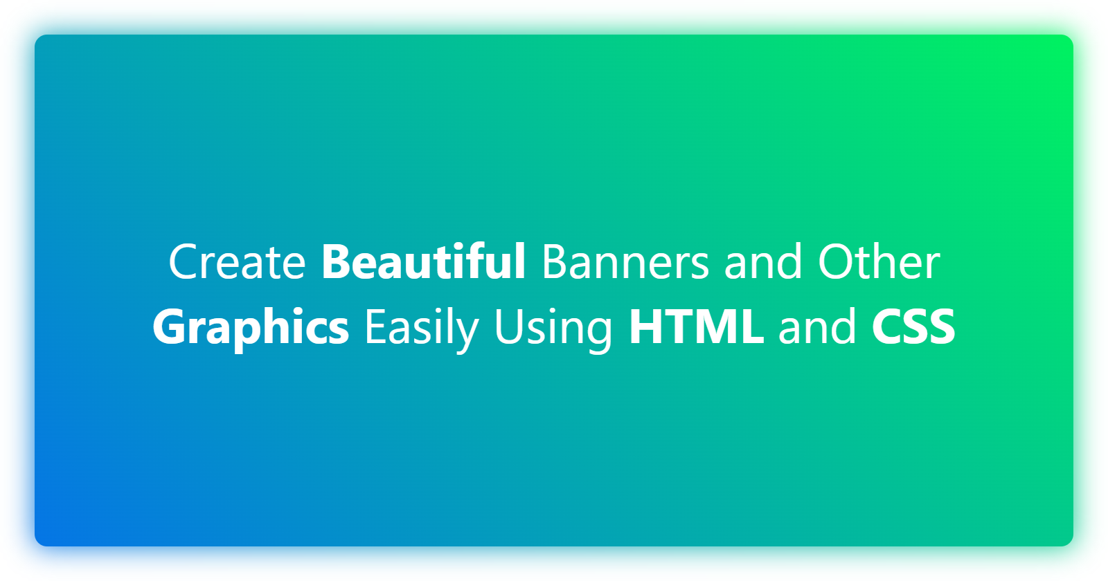
Using ::before on the same element, we can use blur filter in CSS to create a glow effect behind the card with the same gradient background! 👍
<html lang="en">
    <head>
        <meta charset="UTF-8">
        <meta http-equiv="X-UA-Compatible" content="IE=edge">
        <meta name="viewport" content="width=device-width, initial-scale=1.0">
        <title>My Banner</title>

        <style>
            *, *::before, *::after {
                box-sizing: border-box;
            }

            .container {
                width: 1600px;
                height: 840px;
                display: flex;

                /* A little padding to make sure the glow is not occluded */
                padding: 30px;
            }

            .banner {
                /* Whatever width and height seems good for the card within the banner space */
                flex: 1 1 auto;
                background: linear-gradient(45deg,#0575e6,#00f260);
                color: white;
                padding: 5rem;
                font-family: Segoe UI;

                display: flex;
                justify-content: center;
                align-items: center;

                border-radius: 18px;

                /* Explicitly specify relative position so glow::before binds to it as an absolute pseudo element */
                position: relative;
            }

            .glow::before {
                content: "";
                position: absolute;
                height: 100%;
                width: 100%;
                background: linear-gradient(45deg,#0575e6,#00f260);
                z-index: -1;
                filter: blur(20px);
            }

            .text {
                text-align: center;
                font-size: 70px;
            }
        </style>
    </head>
    <body>
        <div class="container">
            <div  class="banner glow">
                <div class="text">Create <strong>Beautiful</strong> Banners and Other <strong>Graphics</strong> Easily Using <strong>HTML</strong> and <strong>CSS</strong></div>
            </div>
        </div>
    </body>
</html>
Gradient Blend Mode Banner
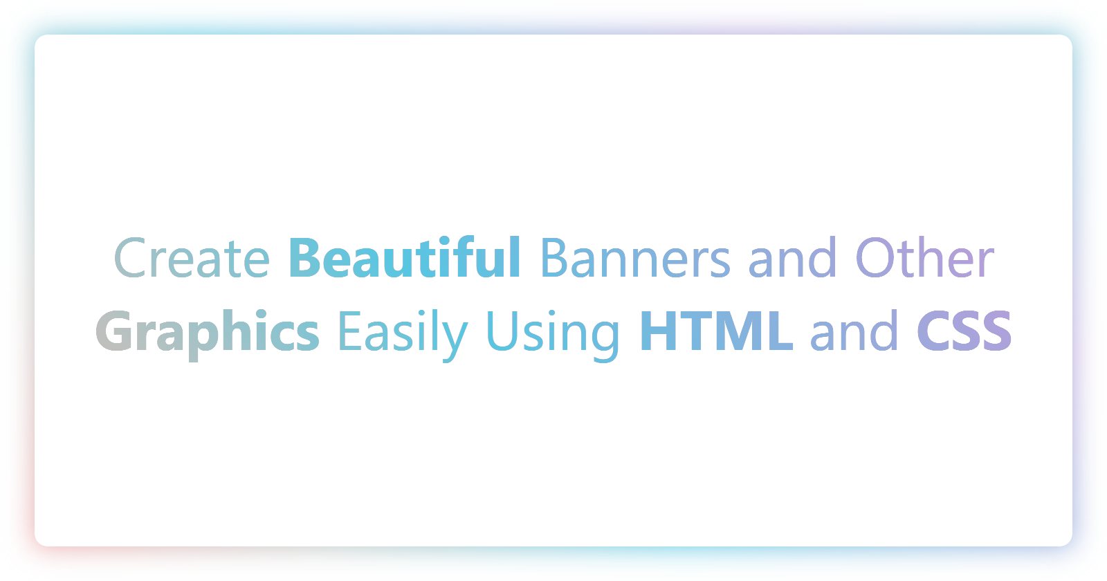
This follows on from the glow effect, and extends it to show a white background for the content and uses mix-blend-mode as a mask to show the gradient in the text itself!
This could probably be simplified, but considering it's just a simple banner to generate an image from, it's of little consequence.
<html lang="en">
    <head>
        <meta charset="UTF-8">
        <meta http-equiv="X-UA-Compatible" content="IE=edge">
        <meta name="viewport" content="width=device-width, initial-scale=1.0">
        <title>My Banner</title>

        <style>
            *, *::before, *::after {
                box-sizing: border-box;
            }

            .container {
                width: 1600px;
                height: 840px;
                display: flex;

                /* A little padding to make sure the glow is not occluded */
                padding: 50px;
            }

            .banner {
                /* Whatever width and height seems good for the card within the banner space */
                flex: 1 1 auto;
                background: linear-gradient(45deg, #eea2a2 0%, #bbc1bf 19%, #57c6e1 42%, #b49fda 79%, #7ac5d8 100%);
                /* color: white; */
                font-family: Segoe UI;

                display: flex;
                justify-content: center;
                align-items: center;

                border-radius: 18px;

                /* Explicitly specify relative position so glow::before binds to it as an absolute pseudo element */
                /* Also for the absolute text element */
                position: relative;
            }

            .glow::before {
                content: "";
                position: absolute;
                height: 100%;
                width: 100%;
                background: linear-gradient(45deg, #eea2a2 0%, #bbc1bf 19%, #57c6e1 42%, #b49fda 79%, #7ac5d8 100%);
                z-index: -1;
                filter: blur(20px);
            }

            .text {
                display: flex;
                align-items: center;
                text-align: center;

                font-size: 80px;

                /* Set the text element to fill its containers space */
                position: absolute;
                inset: 0;

                /* Set the same border-radius as the container, overflow may cause issues */
                border-radius: 18px;

                /* Set the background color of the text element to hide the gradient background of .banner */
                background-color: white;

                /* Set the color to black and then mix-blend-mode to lighten it to the background gradients color */
                color: black;
                mix-blend-mode: lighten;
            }
        </style>
    </head>
    <body>
        <div class="container">
            <div  class="banner glow">
                <div class="text">
                    <span>Create <strong>Beautiful</strong> Banners and Other <strong>Graphics</strong> Easily Using <strong>HTML</strong> and <strong>CSS</strong></span>
                </div>
            </div>
        </div>
    </body>
</html>
Conclusion
That's it for now! I'll most likely keep adding to this article in the future with some more examples as I create more for my own use cases.
Follow me on Twitter to keep up to date with my projects and get notified of new articles like this in the future!