Create a Reusable Button Component in React

Hey! I'm a Full Stack Software Engineer with over 10 years experience in the industry. I've built entire platforms end to end, helped others create amazing things, and have drunk copious amounts of coffee, red-bull and beer to get here. I feel like now is the time I start giving all this knowledge and experience back to younger developers that need it. Hopefully I can help you on your journey to becoming an Engineer.
Introduction
Following good practices allows you to write better code, React is no exception, and after writing button components for every project I have worked on, this is, in my opinion, the best approach for a reusable button component.
NOTE: The examples below are written in TypeScript. If you don't use Typescript, it's easy to get started, alternatively simply ignore any
typedefinitions,: stringnotations after variables, and anything like<ButtonProps>etc.
What makes a React component perfectly reusable
- Having default styles to allow for quick prototyping
- Styling should be completely configurable by its parent
- Should have no dependencies, just drop in and go
- Should use as few props as possible, to reduce complexity of use
- Functionality should be split out, allowing for use only if needed
So, let's start with a simple button component and work to satisfy these constraints.
import React from "react";
export type ButtonProps = {
label: string;
onClick?: () => void;
};
export const Button: React.FC<ButtonProps> = ({ label, onClick }) => {
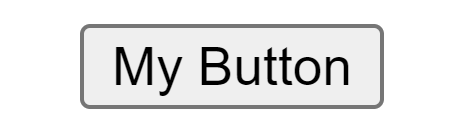
return <button onClick={onClick}>{label}</button>;
};
This renders something like this:
Let's get rid of the base styles and add our own simple styles to make it consistent across browsers:
.button-compatibility-styles {
    outline: none;
    border: none;
    padding: 0;
    margin: 0;
    background: none;
    fontSize: 1em;
};
Now let's add some simple base styles in case none are provided:
.button-base-styles {
    color: black;
    background: lightgray;
    padding: 0.4em 1em;
    border-radius: 0.2em;
    cursor: pointer;
}
And add them to our component:
export const Button: React.FC<ButtonProps> = ({ label, onClick }) => {
    let buttonClasses = ["button-compatibility-styles", "button-base-styles"];

    return (
        <button className={buttonClasses.join(" ")} onClick={onClick}>
            {label}
        </button>
    );
};
This doesn't allow for overriding the base styles though, so let's add styles and className props, and conditionally apply it to our component, providing the base styles if none are supplied:
export type ButtonProps = {
    label: string;
    onClick?: () => void;
    style?: string;
    className?: string;
};

export const Button: React.FC<ButtonProps> = ({
    label,
    style,
    className,
    onClick
}) => {
    // Always set the compatibility styles
    let buttonClasses = ["button-compatibility-styles"];

    // If className is provided, append it
    if (className) buttonClasses.push(className);

    // If no styles are provided, provide base styles
    if (!style && !className) buttonClasses.push("button-base-styles");

    return (
        <button
            style={style}
            className={buttonClasses.join(" ")}
            onClick={onClick}
        >
            {label}
        </button>
    );
};
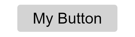
We provide the compatibility styles as a CSS class, because if we provided them as React style objects, they would not be able to be overridden by a parent component specifying className!
After all this setup, we have a button that looks about the same as before! 😂

Extra Functionality
Now that we have our base button component, we can add extra functionality that is commonly needed from a button component. However, we want to enable this functionality only if it is specified by the parent component, and allow the parent to override its styling without affecting the rest of the button. We can do this using child components.
Loading Spinner
A loading spinner is a very common requirement for a button and allows for the user to show that something is happening.
A loading spinner should:
- Be visible once the user clicks the button
- Prevent the user from clicking the button whilst its shown
- Not force the parent component to maintain the state of the loading spinner
- Not have any dependencies to show the spinner
To do this we need to create a component that renders the spinner:
.svg-loading-spinner {
    width: 1em;
    height: 1em;
    position: absolute;
    inset: 0;
    margin: auto;

    animation: spin 1s linear infinite;
}
export type ButtonLoadingSpinnerProps = {
    style?: CSSProperties;
    className?: string;
    color?: string;
    backgroundColor?: string;
};

export const ButtonLoadingSpinner: React.FC<ButtonLoadingSpinnerProps> = ({
    style,
    className,
    color,
    backgroundColor
}) => {
    return (
        <svg
            style={style}
            className={`svg-loading-spinner ${className}`}
            viewBox="0 0 40 40"
        >
            <circle
                cx="20"
                cy="20"
                r="16"
                fill="none"
                strokeWidth={6}
                stroke={backgroundColor || "darkgray"}
            />
            <path
                d="M3,20 a1,1 0 0,0 34,0"
                fill="none"
                strokeWidth={6}
                stroke={color || "black"}
            />
        </svg>
    );
};
This is a simple SVG that is spins via a simple CSS animation. It also allows for the parent to override its style, className, color, and backgroundColor.
Putting it all together
Now we just need to provide the component to our Button component, and render it accordingly. We need to do this in a way that facilitates a loading state so its only shown when clicked. BUT:
- Should use as few props as possible, to reduce complexity of use
We could create a loading prop, and have the parent implement a loading state, but from my experience, this is always used in the same manner, so instead, we are going to extend the Button to dynamically switch to a loading state internally if a loading component is provided, and the onClick returns a promise! 🔥
export type ButtonProps = {
    label: string;
    onClick?: () => void | Promise<void>;
    style?: CSSProperties;
    className?: string;
    loadingComponent?: React.ReactNode;
};

export const Button: React.FC<ButtonProps> = ({
    label,
    loadingComponent,
    style,
    className,
    onClick
}) => {
    const [loading, setLoading] = useState<boolean>(false);

    // Always set the compatibility styles
    let buttonClasses = ["compatibility-styles"];

    // If className is provided, append it
    if (className) buttonClasses.push(className);

    // If no styles are provided, provide base styles
    if (!style && !className) buttonClasses.push("base-styles");

    const onClickInternal = async () => {
        if (!onClick || loading) return;

        const prom = onClick();
        if (prom && loadingComponent) {
            setLoading(true);
            await prom;
            setLoading(false);
        }
    };

    return (
        <button
            style={style}
            className={buttonClasses.join(" ")}
            onClick={onClickInternal}
        >
            <span style={{ visibility: loading ? "hidden" : "visible" }}>
                {label}
            </span>
            {loading && loadingComponent}
        </button>
    );
};
Here we have added a loadingComponent prop and wrapped the label in <span>. This lets us toggle its visibility based on our new loading state boolean. We also conditionally show the loadingComponent only if loading is true.
We also added a check that returns when calling onClickInternal if we are already in a loading state, preventing clicks whilst it's loading.
We have also added onClickInternal which wraps the provided onClick prop. If we have onClick, we call it. If it is an async function and it returned a Promise, and we have a loadingComponent, we set loading to true, await the Promise, and finally set loading to false again.
Let's test it!
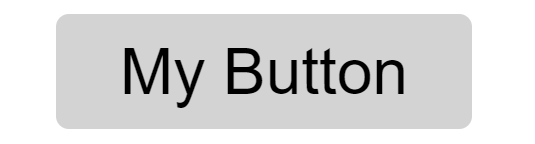
Just defining the button:
<Button label="My Button" />
Gives us:
As we might expect. Let's try providing the loading spinner, and an async onClick that resolves after 2 seconds:
 <Button
    label="My Button"
    onClick={() => new Promise((res) => setTimeout(res, 2000))}
    loadingComponent={<ButtonLoadingSpinner />}
/>
Great! Looks like its working nicely, and most importantly:
- All styles can be overridden to create any button we like, including the
ButtonLoadingSpinner - The
ButtonLoadingSpinnercan be completely replaced with a completely different indicator if needed - We are not requiring the parent component to needlessly manage any state
- We are minimizing the props required to perform the expected functionality
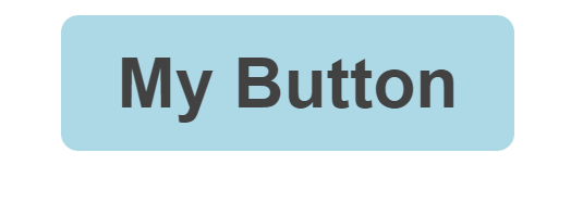
Lastly, let's add a little style to the button and jazz it up a bit:
button.my-custom-button {
    padding: 0.4rem 0.8rem;
    font-weight: bold;
    background-color: lightblue;
    color: #424242;
    border-radius: 4px;
    cursor: pointer;

    transition: all 0.2s linear;
}

button.my-custom-button:hover {
    background-color: rgb(109, 199, 230);
    color: #424242;
    box-shadow: 0px 5px 8px 0px rgba(0, 0, 0, 0.4);
}
 <Button
    label="My Button"
    className="my-custom-button"
    onClick={() => new Promise((res) => setTimeout(res, 2000))}
    loadingComponent={
        <ButtonLoadingSpinner
            color="#424242"
            backgroundColor="lightblue"
        />
    }
/>
This produces:
Conclusion
That's it! I hope this article helped you get a sense of how components can be made reusable in react.
Follow me on Twitter to keep up to date with my projects and get notified of new articles like this in the future!


