Create Beautiful 3D Perspective Images Easily Using React and CSS

Hey! I'm a Full Stack Software Engineer with over 10 years experience in the industry. I've built entire platforms end to end, helped others create amazing things, and have drunk copious amounts of coffee, red-bull and beer to get here. I feel like now is the time I start giving all this knowledge and experience back to younger developers that need it. Hopefully I can help you on your journey to becoming an Engineer.
Introduction
Perspective transform looks great and creates a really nice experience for the user. When using a framework like React, implementing something like this becomes super simple only using a few CSS styles 👍
Setup
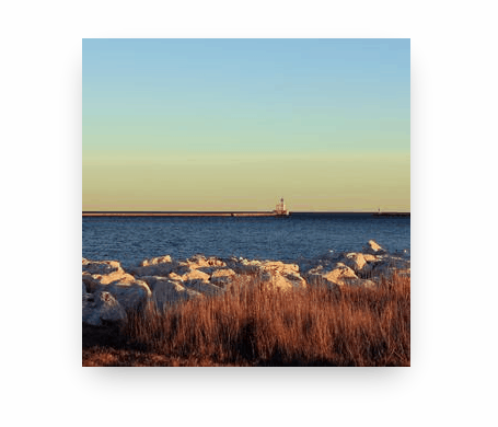
Lets start with a simple Image component:
const Image = ({ width, height, src, alt }) => {
    return <img width={width} height={height} src={src} alt={alt} />;
};
This just takes our basic props and applies them to an img element.
Now let's add our base styles ready for manipulation, along with the state we will need:
const Image = ({ width, height, src, alt }) => {
    const [scale, setScale] = useState(1);
    const [rx, setRx] = useState(0);
    const [ry, setRy] = useState(0);

    return (
        <img
            width={width}
            height={height}
            src={src}
            alt={alt}
            style={{
                transition: "transform 150ms linear",
                transform: `perspective(1000px) rotateX(${ry}deg) rotateY(${rx}deg) scale3d(${scale},${scale},${scale})`
            }}
        />
    );
};
It may look a little intimidating at first! But it's really not that complex. First we defined scale, rx and ry state variables to handle the state changes we are yet to implement.
Then we added two styles. transition: "transform 150ms linear" applies an animation to any changes on the transform style over 150ms using the ease-out timing function. We also added transform which is where the magic happens. Let's break it down.
The transform style is performing 4 operations. perspective(1000px) is what gives the 3d perspective effect to the image. Without it, the rest of the operations would still apply but it wouldn't give an appearance of depth. The value of 1000px is generally a good value to use and looks good, you can play around with this value to see what it does and can make some crazy effects by setting it really low 😂. rotateX(${ry}deg) is injecting the ry value telling the image to rotate on the x axis, we inverse the x and y axis when applying the values as rotating the x axis tilts the image back and forth not left to right, so its intuitive to the user when moving the mouse over it to inverse these values. The same goes for rotateY(${rx}deg). scale3d(${scale},${scale},${scale}) is applying scale to all 3 axis, this will give a nicer effect when we add our math to make the image a little larger whilst the users cursor is hovering over it.
In most browsers, changing the perspective of an element won't work without specifying a scale3d() function. I'm not sure if this is intentional or not, but for now, even if we don't want to scale an element, we still have to set scale3d(1,1,1).
A Little Math
Let's add in our event handlers and do a little math!
const Image = ({ width, height, src, alt }) => {
    const imgRef = useRef();
    const [scale, setScale] = useState(1);
    const [rx, setRx] = useState(0);
    const [ry, setRy] = useState(0);

    const onMouseMove = (ev) => {
        // Get the bounding rect for the image
        const rect = imgRef.current.getBoundingClientRect();

        // Get the X and Y position of the cursor relative to the image
        const x = ev.clientX - rect.left;
        const y = ev.clientY - rect.top;

        // Funky math to normalize the x/y position of the cursor
        // to between -20 and 20
        // For the effect to work as expected, the X axis need to be inversed
        const nX = 40 - (x * 40) / rect.width - 20;
        const nY = (y * 40) / rect.height - 20;

        // Set rx and ry
        setRx(nX);
        setRy(nY);

        // Set the scale to 1.1 shilst the cursor is over the image
        setScale(1.1);
    };

    const onMouseLeave = () => {
    // When the cursor leaves the image, reset the state back to default values
        setRx(0);
        setRy(0);
        setScale(1);
    };

    return (
        <img
            ref={imgRef}
            width={width}
            height={height}
            src={src}
            alt={alt}
            onMouseMove={onMouseMove}
            onMouseLeave={onMouseLeave}
            style={{
                transition: "transform 150ms linear",
                transform: `perspective(1000px) rotateX(${ry}deg) rotateY(${rx}deg) scale3d(${scale},${scale},${scale})`
            }}
        />
    );
};
Its Alive!
We added an onMouseMove event to handle getting the position of the cursor relative to the image element, and normalized those x/y values to between -20 and 20. This allows us to simply apply those values to the rotateX and rotateY transform functions by setting them into rxand ry!
onMouseLeave simply resets the state for rx, ry and scale to their default values and returns the image to it's default state.
A Little More Flare
This looks great but another great feature that can be used in tandem with all this is box-shadow as perspective transforms render the shadow as well! Better yet, we can swap the shadow out for a glow effect when the user starts hovering over the image to really make it pop 🎉
const BASE_SHADOW = "rgba(0, 0, 0, 0.4) 0px 12px 28px -10px";
const GLOW_SHADOW = "rgb(113,199,236) 0px 0px 15px 5px";

const Image = ({ width, height, src, alt }) => {
    const imgRef = useRef();
    const [scale, setScale] = useState(1);
    const [rx, setRx] = useState(0);
    const [ry, setRy] = useState(0);
    const [shadow, setShadow] = useState(BASE_SHADOW);

    const onMouseMove = (ev) => {
        // Get the bounding rect for the image
        const rect = imgRef.current.getBoundingClientRect();

        // Get the X and Y position of the cursor relative to the image
        const x = ev.clientX - rect.left;
        const y = ev.clientY - rect.top;

        // Funky math to normalize the x/y position of the cursor
        // to between -20 and 20
        // For the effect to work as expected, the X axis need to be inversed
        const nX = 40 - (x * 40) / rect.width - 20;
        const nY = (y * 40) / rect.height - 20;

        // Set rx and ry
        setRx(nX);
        setRy(nY);

        // Set the scale to 1.1 shilst the cursor is over the image
        setScale(1.1);

        // Set the glow shadow effect
        setShadow(GLOW_SHADOW);
    };

    const onMouseLeave = () => {
        // When the cursor leaves the image, reset the state back to default values
        setRx(0);
        setRy(0);
        setScale(1);
        setShadow(BASE_SHADOW);
    };

    return (
        <img
            ref={imgRef}
            width={width}
            height={height}
            src={src}
            alt={alt}
            onMouseMove={onMouseMove}
            onMouseLeave={onMouseLeave}
            style={{
                boxShadow: shadow,
                transition: "all 150ms linear",
                transform: `perspective(1000px) rotateX(${ry}deg) rotateY(${rx}deg) scale3d(${scale},${scale},${scale})`
            }}
        />
    );
};
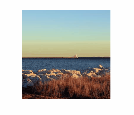
And here is the final result!
We set a couple of constant values BASE_SHADOW and GLOW_SHADOW, added a new shadow state variable and switched between them in the same way as the other state values. We also added the boxShadow style on the img element, applying shadow.
Notice a small change was made to
transitionfromtransform 150ms lineartoall 150ms linear, this ensure that the transition animation is also applied to thebox-shadowand not just thetransitionstyle.
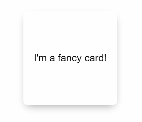
It Doesn't Have to be an Image!
Since this is just using CSS transforms, it can be applied to anything! Here is the same component edited to use a div with some text in it 👍
Conclusion
That's it! I hope this article helped you do fancy things with CSS transforms.
Follow me on Twitter to keep up to date with my projects and get notified of new articles like this in the future!


